@jalanInterior.com
Last year’s Pantone Color of the Year, according to Laurie Pressman, vice president of the Pantone Colour Institute, "reflects what is happening in our global society and expresses what people are asking for that colour might hope to answer." Each year, experts at Pantone choose a colour for the respective year by researching colour influences from all over the world, including the entertainment industry, art collections, emerging artists, fashion, home furnishings, design fields, well-known travel destinations, as well as new lifestyles, play styles, and socioeconomic conditions.
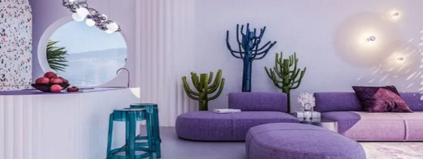
For the first time in history, a new colour has been created for Pantone Colour of the Year to reflect global innovation and transformation. The richness of this new red-violet-infused blue hue emphasizes the vast possibilities that lay before us, says Laurie, as society continues to embrace colour as a crucial form of communication, a method to convey and effect thoughts and emotions, engage and connect. Last year, the global authority on colour, Pantone, had chosen ‘Very Peri’ as the colour of the year”. Very Peri is a vibrant violet-red undertoned periwinkle blue colour that combines the fidelity and consistency of blue with the vigour and thrill of red, according to Pantone.
The gorgeous violet-infused blue tone is present in the vibrant plumage and exquisite lavender blossoms in nature. The tranquillity of blue and the exuberance of red are combined in the dramatic periwinkle blue shade with an invigorating violet-red undertone. As a result, the Pantone blue shade represents tranquillity, inspiration, knowledge, and health. It also embodies the inventiveness, fun, and delight of the violet tones. Thus, Veri Peri is a colour that has the best qualities of both hues. Very Peri casts a new light on the future by rekindling admiration for some of the traits that blue stands for and adding a fresh perspective that applies today.
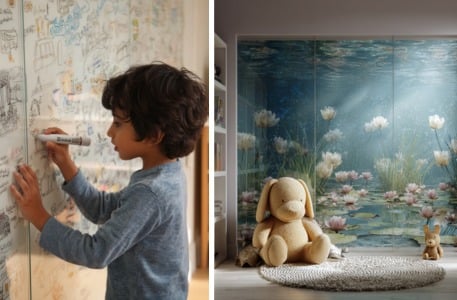
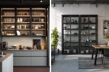
Now with Saint-Gobain’s new Colourmax range, you can bring Veri Peri to your homes with absolute ease! Colourmax is a new range of lacquered glass which breaks the barriers of colour limitations and allows one to choose from any hues that surround us! Not just Veri Peri, but customize your home interiors with colours that compliment this shade as well! This unique violet-infused blue shade can provide many lively colour combinations, so designers can create options to achieve diverse moods. Let us look at how it can be used with vivid colour palettes and integrated into interior space design.
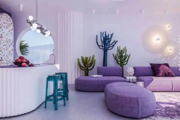
With SGG Colourmax, add Veri Peri accents to the walls of the living room or bedroom to add individuality and a lively mood. A splash of this colour keeps the space from seeming clinical and monotonous as the cool hues provide calming energy to the room. The accents can be teamed with base colours, prints and textures.
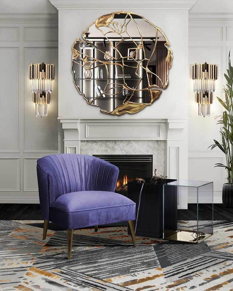
Image by @bocadolobo on Instagram
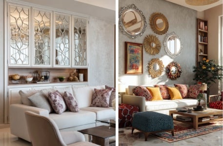
Very Peri may be used as a striking accent colour among a carefully chosen selection of neutrals owing to this colour scheme. The hues emphasize timeless beauty while fostering sophistication and elegance. If one does not want to commit to using this striking colour in copious amounts, add a splash of colour and utilize it for the objects and accessories. A vase of purple flowers, artwork with periwinkle tones or a couch with very peri hues, teamed with a white lacquered glass coffee table, mirror decor or wall panelling are some ideas.
source: Aufloria
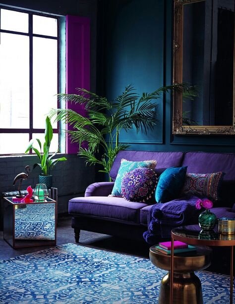
Given that periwinkle frequently appears in nature, in flower beds, leaves, underwater and even sky colour, it is sure to blend well with other natural hues. For a gentle, calm appearance, one can use it in a colour scheme of hues offered by SGG Planilaque like Cool Earth, Ivory, Calm sky blue and olive green to name a few. Very Peri can help create a serene environment when used with colour schemes inspired by nature. One can choose darker accent hues like cobalt and forest green for a bolder impression.
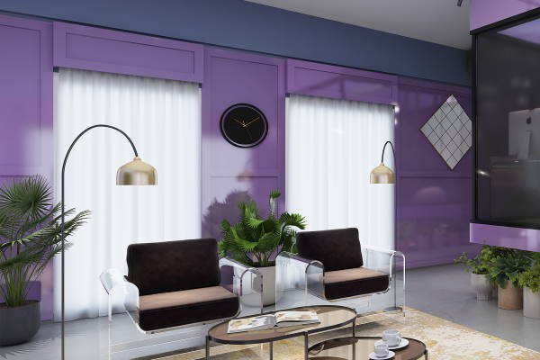
Image Credits: Saint-Gobain
Very Peri is a vivid colour. Introduce similar, blue-tinged purples or shades of white, grey or beige into your interior decor for a subdued combination. Use different shades of the same colour in combinations as glass partitions or on accent walls. SGG Planilaque’s Casis Purple can be the perfect bold partner for this shade. Choose from the wide range of SGG Planilaque colours to team with the tint and create dynamic combinations.
Embrace the charm of this brand new and stunning Very Peri colour to make your house a chic place to live and experience.
What is the Very Peri color trend, and why is it significant?
The Very Peri color trend is a unique blend of red-violet and blue hues that has been identified as a trendsetting color in design. Its significance lies in its ability to evoke a sense of creativity and innovation, making it a popular choice for modern interiors looking to make a bold statement.
How can Very Peri be incorporated into home design?
Very Peri can be incorporated into home design through various elements such as lacquered glass accent walls, furniture, besides textiles, and decorative accessories. Its versatile nature allows it to complement a wide range of styles, from contemporary to eclectic, adding a vibrant and dynamic feel to any space.
What are the psychological effects of using Very Peri in interior design?
Using Very Peri in interior design can evoke feelings of calmness, creativity, and positivity. The blend of blue tones, known for their calming effect, with the energy of red-violet, creates a balanced and harmonious atmosphere that stimulates both relaxation and inspiration.
In what areas of the home is Very Peri most effective?
Very Peri is most effective in areas like living rooms, bedrooms, and creative spaces where its vibrant hue can energize and uplift the environment. It can be used as a focal point in these spaces to draw attention and add a contemporary edge to the design.
How can Very Peri be paired with other colors in a home?
Very Peri can be paired with neutral tones like gray and beige to create a balanced look or with contrasting colors like yellow and green for a more dynamic and vibrant palette. This flexibility allows it to be used in various design schemes, enhancing both modern and traditional interiors.
Shiza Christie is an Architect - and Urban Designer, an observer of the phenomenon of time, and forever enchanted by the power of words. Read More