The colour palette is the heartbeat of any home. From the walls that envelop you in comfort to the subtle hues of the furnishings, every colour works in harmony to set the tone, evoke different emotions, and create a unique living experience. Whether you're drawn to the fiery embrace of warm colours or the tranquil allure of cool tones, this colour selection guide will walk you through the art and science of picking the right shades for every space.
When designing a colour scheme for a room, start by defining the mood you want to create. Every shade—whether light, bright, or dark—plays a distinct role in shaping the ambience and character of a space. Understanding the different categories of colours can help you make informed choices that enhance your interior environment.
Below, we explore the key colour types and their impact on home design.
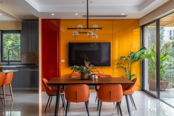
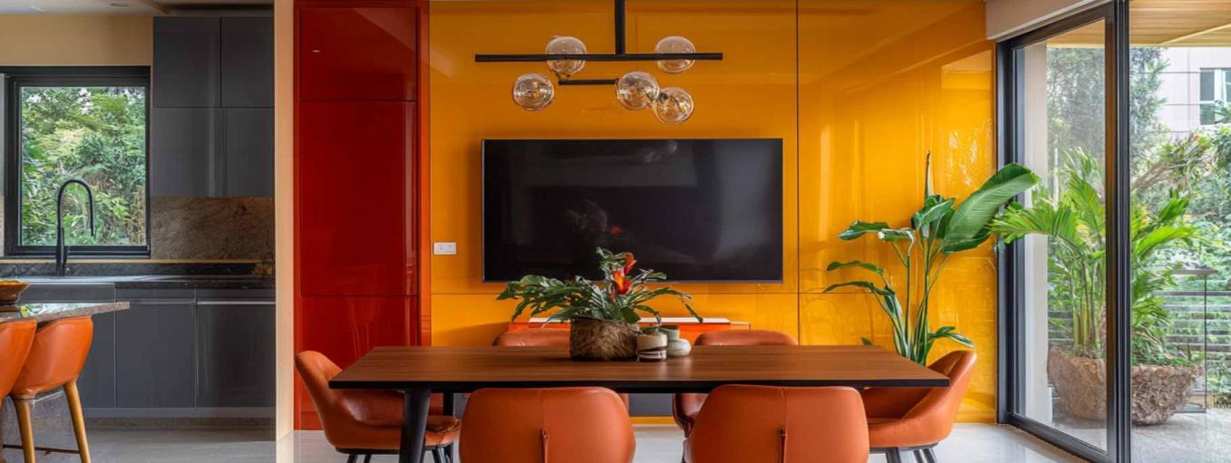
Lacquered Glass TV Backdrop in Warm Tones Make a Statement
Warm colours like reds, oranges, and yellows bring a sense of energy and vibrancy, making spaces feel inviting, cosy, and full of life. These shades work beautifully in social areas like dining rooms and living spaces, where warmth and connection matter the most.
To enhance the impact of a warm colour palette, consider incorporating SGG Colormaxx lacquered glass in bold reds or deep oranges for a seamless, reflective touch that amplifies depth and brightness.
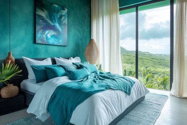
Natural Light Illuminating the Cool Tones in Bedroom Design
In contrast, cool colours such as blues, greens, and violets bring a sense of calm and relaxation. These soothing colour choices are ideal for bedrooms where you want to unwind and rejuvenate. When paired with expansive high-performance glass windows, they amplify natural light and blur the boundaries between indoors and outdoors, creating a refreshing and light-filled ambience.
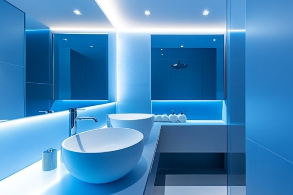
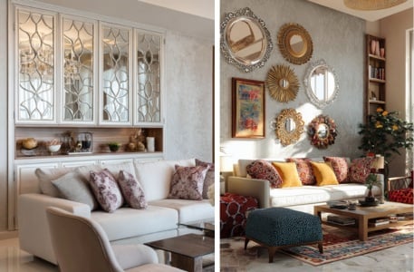
LED Mirrors Boost Brightness and Appeal
Cool colour schemes also have a receding quality, making them ideal for smaller spaces like bathrooms, where they enhance the feeling of openness. Paired with LED mirrors like SGG Aspira, they effortlessly reflect light, enhancing brightness and aesthetics.
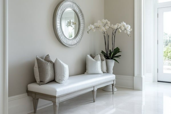
Soft Monochromatic Colours Add a Cohesive yet Dynamic Look
A monochromatic colour scheme revolves around variations of a single hue, exploring different shades, tints, and tones to create a layered and sophisticated look. These colours for home interiors ensure a cohesive aesthetic, making them ideal for foyer areas, small bedrooms, and modern living spaces where subtle elegance is key.
Playing with the intensity of one colour with textures and reflective finishes like mirrors creates dimension and visual interest without overwhelming the space.
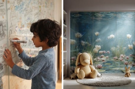
Blue-coloured Lacquered Glass Wall doubles as a Writing Board for Creativity
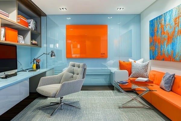
To find the best colour combinations for your home, consider complementary shades—hues opposite each other on the colour wheel, like blue and orange or red and green. Their dynamic interplay creates visual excitement and a vibrant, balanced aesthetic, making them ideal for a kid’s room.
A cool, light blue space can feel more lively with pops of orange through decor and accents, striking a perfect balance between energy and calm. For a functional yet stylish touch, a lacquered glass accent wall doubles as a writing board, adding a playful, modern element while ensuring creativity, durability, and easy maintenance.
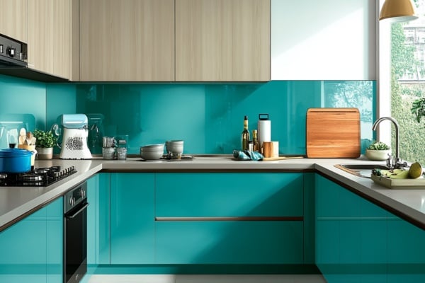
Analogous Colour scheme with Glossy Finishes and Textures Creates a Harmonious Design
Analogous colours sit next to each other on the colour wheel, such as blue, teal, and green, creating a naturally harmonious flow. This colour scheme blends seamlessly, offering a calm and unified aesthetic, making it ideal for kitchen designs and open-plan spaces.
Layering in textured fabrics, glossy finishes like lacquered glass, and natural materials adds depth and character to the space while further enriching the colour palette.
Lighting plays a pivotal role in how colours appear and interact within a space. Since colour is a reflection of light, its type, direction, and intensity—whether natural or artificial—can dramatically alter the perception of hues in fabrics, paint, furniture, and other surfaces.
For instance, natural light changes throughout the day, shifting how colours in interior design differ from morning to evening. A north-facing room may make colours appear cooler and muted, while a south-facing space enhances warmth and vibrancy.
The kind of artificial lighting you choose matters—warm-toned bulbs enrich earthy and warm hues, while cool white LEDs can make cooler tones pop but may wash out warmer hues.
Beyond lighting, materials and finishes also play a crucial role in how colours are perceived. Glass and mirrors act as visual amplifiers, distributing light more evenly and enhancing the overall depth, dimension, and vibrancy of your interior colour scheme.
By thoughtfully integrating lighting, glass, and mirrors, you can elevate your colour scheme and ensure that every shade and texture reaches its full potential.
How do I choose the perfect colour scheme for my home?
Selecting the right colour scheme for your home starts with understanding the mood and functionality of each space. A well-balanced colour palette consists of a dominant colour, a secondary shade, and an accent hue to create depth and harmony. Consider the best colour combinations for home interiors based on factors like natural light, room size, and personal preferences.
What are the best colours for small rooms to make them look bigger?
Choose light and neutral colours in interior design to create an open and spacious feel. Shades like soft whites, pastels, beiges, pale blue, sage greens and light greys reflect more light, enhancing the perception of space. Incorporating mirrors or glass surfaces further amplifies light, accentuating the colours for home interiors effectively. SGG Planliaque, a beautiful back-painted lacquered glass comes in 7 elegant shades that are in line with classic & contemporary trends.
What is the 60-30-10 rule in interior color selection?
The 60-30-10 rule is a simple colour selection guide for a balanced colour scheme:
What are the best accent wall colors for modern interiors?
Accent walls are a powerful way to introduce contrast and character into a space. From deep blue and greens to terracotta & earthy tones and bold reds or mustard yellows, selecting the right colour choices can make a desired impact. Consider lacquered glass in deep hues for an accent wall to make a style statement in the space. Explore SGG Colormaxx Dura, the newest range of lacquered glass in toughened variant is available in 216 RAL shades to create exciting interior spaces.
Jahanavi Arora is an architect by profession and a writer by choice, with over 7 years of experience in architecture and design writing. Read More