SGG Planilaque is a range of lacquered glass, colored interior glass, designed to breathe life into interior spaces with its gloss and vibrance. Inducing brilliance and freshness, this range introduces contemporary trends to evoke innovation and creativity, not only from spaces but from occupants of the spaces as well.
Let us look at the different SGG Planilaque color palettes and the moods they create through their usage.

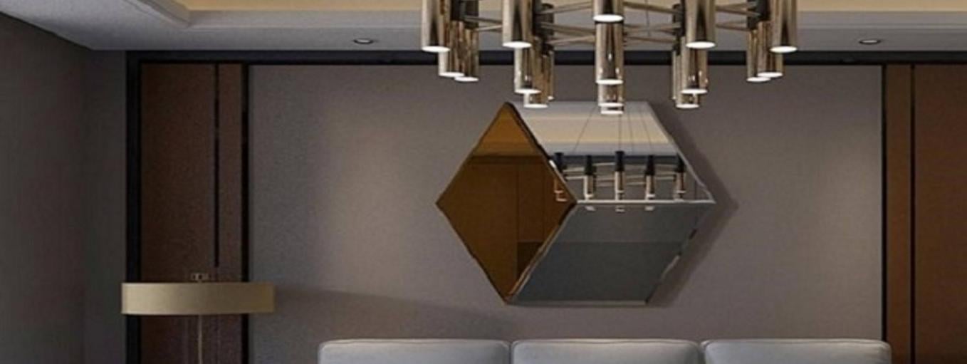
A color scheme that mimics the soothing, natural tones of the earth is offered by a family of warm neutrals that includes warm whites, ivory, beige, and deep browns. A combination of this color palette helps in creating timeless spaces of warmth and comfort that inspire and endure. Brown can do wonders in large rooms to harmonize the contemporary and classic with its natural color and comforting essence. Wall accents and paneling of Choco brown and extra white or grey can create a warm and cozy ambiance that is perfect for a living area. Additionally, it can be accentuated by using tinted mirrors on the wall of the same palette to liven up the interior design.

The colours available in this color palette are Ivory, Mint green, Solar Yellow and Almond Green. These half-tones offer a soft wash of color and are influenced by the understated Scandinavian hues and the glitz of La Dolce Vita. The brilliance, depth, and sophistication of interior glass contrast with the delicate, subtle colours.
These semitones can be used sparingly as wall accents and as glass partitions between the living and dining areas, in combination with both darker (brown, black) as well as lighter tones (white, off-white) to achieve a sober and relaxed mood in the living space.

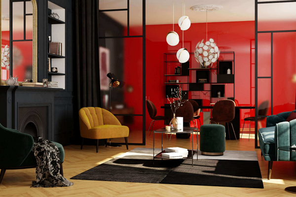
This color palette comprises intense blues and deep velvety reds with colours like Opera Red, Casis Purple, Calm Sky, and Olive Green. These deep hues are symbolic of sophistication and give any interior design a serene, subtle air of elegance. These are shades that can give any space a sophisticated, theatrical character. Royal blue and opera red glass can be used for wall accents especially in entertainment dens or formal living rooms. Darker shades of interior colored glass such as royal blue as primary colours can be paired with olive green and used for the kitchen, playroom, etc.
This Planilaque color palette is inspired by the smooth and shiny finish of everyday objects. Metallics are considered to be the regal colous of majesty. The colours available in this interior glass palette Argent Metallise, Vert Onyx, Metallise Champagne impart a subtle yet strong effect to spaces. These shades are perfect for a Baroque style interior theme and also blend well with Neoclassical palettes.
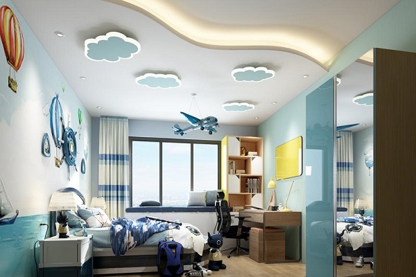
The colours available in this interior glass color palette are Sky Blue, Aquamarine, Lemon Yellow, and Petal Pink. The delicate tones of this palette evoke sentiments of pleasant warmth and good cheer while still being lively and not overpowering. Aesthetically pleasing, they evoke a sense of cheerfulness. Various combinations of this colored glass palette can be extensively used in kid’s playrooms, informal living areas, dining areas, and even bedrooms. As patterned colorful glass partitions and as kitchen backsplashes, these colours blend simplicity with playfulness.
A palette of unadulterated hues that give life fresh energy include Flame Red, Fusion Orange, Aqua Blue, Pista Green, and Atoll Blue. Spaces get depth and personality via the use of vibrant reds, lively greens, and unusual raspberries. These striking, mood-enhancing hues give one's interior design a distinctive touch. These high-impact shades are also best used in combination with subtle neutrals or monochrome colours for accent walls, wardrobe shutters/partitions, kitchen backsplashes, etc.
This lacquered glass color scheme of deep black, pristine white, and grey is inspired by the cold mineral hues of stones and metals and has a clean, recognisable aesthetic. Crafting a décor is all about going back to the classics – a daringly modern statement that embraces its urban roots. This color palette of SGG Planilaque lacquered glass is for people who prefer minimalism to the core and want to create a zen-like somber atmosphere in any living space.
What is Planilaque, and how is it used in interior design?
Planilaque is Saint-Gobain's range of colored, lacquered glass that is used in interior design to add vibrant, glossy surfaces to various applications like wall paneling, furniture, and backsplashes. It provides a rich palette of colors that can set different moods and styles in a space, from bold and dramatic to soft and soothing.
How does Planilaque contribute to the mood of a room?
Planilaque contributes to the mood of a room by offering a range of colors that can influence the atmosphere. Bright, bold colors can energize a space, while softer, neutral tones can create a calming, serene environment. The glossy finish of the glass also adds a touch of sophistication and modernity.
What are some common applications of Planilaque in interior spaces?
Common applications of Planilaque in interior spaces include kitchen backsplashes, wall panels, wardrobe doors, and tabletops. Its versatility and color range make it suitable for various design schemes, allowing designers to create personalized and visually striking interiors.
Why is Planilaque a preferred choice for modern interior design?
Planilaque is a preferred choice for modern interior design due to its combination of vibrant color options, high gloss finish, and durability. It allows designers to incorporate bold, contemporary elements into their projects, which are easy to maintain, thereby enhancing the visual appeal and functionality of spaces.
How can Planilaque be integrated into different design styles?
Planilaque can be integrated into different design styles by choosing colors that complement the overall aesthetic. For example, bright colors can be used in modern or eclectic interiors, while neutral or pastel shades can enhance minimalist or Scandinavian designs. Its versatility makes it adaptable to a wide range of interior styles.
Shiza Christie is an Architect - and Urban Designer, an observer of the phenomenon of time, and forever enchanted by the power of words Read More